Worst TV Logo Competition
Main Content Last Revised Sa 7-Sep-96

|
Worst TV Logo Competition Main Content Last Revised Sa 7-Sep-96 |
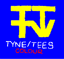
 The old Tyne Tees logo.
|
Which television company has the worst logo? That's the question posed in the USENET TV newsgroups by Stuart Burns who wrote: I caught the end of a kids' TV show on ITV this morning and saw that it was made by Tyne Tees TV. I haven't seen this particualr logo in a long time, but the one I saw today was horrendous. Very garish and cheap looking. There are a lot of ITV logos which are not seen very often on the network. Which is the worst? William HamBevan agreed... TT must rank as the worst, although I'm not immensely fond of the newish logo for my local provider, HTV. Is it just me, or is there an absolute lack of imagination with ITV station idents these days? Another contender might be the Westcountry logo, which consists of... the letter 'W'. Even Meridian, who at least made an effort to come up with something original, couldn't do better than that conglomeration of blobs and spikes. I blame computer graphics. |

|
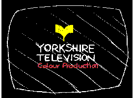
William also had a startling confession to make... I have to admit that I was scared shitless of the Yorkshire TV sign as a kid, and had frequent nightmares about it. And he wasn't the only one. Gillian Hardy was also scared, as was Simon Harvey: I used to think that some massive great yellow thing would come and attack me with a load of trumpets - but I did like watching it (I was strange, I know...) And another victim of YTV-logo-itis was Tristan Haxell: ...Any Psychologists care to explain? |
William again:
Yes!!! It can't just be me: there must be thousands of 70s children traumatised for life by the spectre of a flying Yorkshire Sign (it used to attack me and tickle me under the arms...) And that creepy jingle... (Der der-der der DER!)
Remember the opening to 3-2-1, where the flying 'V' plunged into Dusty Bin? That produced the worst nightmares of all!
God only knows what Freud would make of this...
Spookily enough, when the Daily Telegraph printed a screen grab of the TV Logos of the Seventies, they printed only nine of the ten logos. Which one did they miss off? YTV. Could the Telegraph have judged the YTV logo just too plain scary for their pages? (Probably not!)
Ben Murray emailed me about his telelogophobia too:
Yorkshire never scared me (the logo, that is. The place scared me shitless) but I'll tell you two that did.
First of all the Thames logo where it was mirrored in the middle.No cause for alarm, I hear you cry, and, true, to most people, no cause for alarm. However as a young child I saw an episode of the Kenny Everett TV Show in which he leapt through the Thames logo. From that day forward I trembled when I saw the Thames logo in anticipation of A scary looking man leaping through it.
The other one that scared me was the Open University one from the 70's which I used to catch when up early on a saturday waiting for the kids TV. It was that sort of shield shape with a circle cut out. Scary. And that horn music which would always start after aeons of silence and when I least expected it. Double scary.
Anyway, back to the competition. Steve Phillips wrote:
The (very) old WWN logo was simply those letters, in white on black, in a rectangle, stencilled in something like Helvetica Bold which unsteadily grew larger as the cameraman shakily zoomed into it. Eventually it would stop, slightly left of centre and at a 5 degree slope!
Mr K J Beeley wrote:
I think though, if you want TRULY bad signs, you have to go into the vaults. When BBC2 did "TV Hell" night, they had an entire 5 minute show dedicated to them. I rate the old "Ulster" one very lowly, but NOTHING can beat the cheap, Airfix model that Anglia used to shove on that record turntable :)
...if they hadn't changed it, I would have said that the first Carlton intro's were PATHETIC. "This is Carlton; Television for London", said by some nobody that you're never likely to see in the street.
I have visions of some cheap sign-writer coming in with his masterpiece to the new offices of the as yet unheard of TV company.
HIM: There you go, mate, new logo for Carlon television. That'll be £50, please. THEM: What? HIM: £50. THEM: No, what did you say was on the sign? Let's see... You bloody fool man, it's supposed to say CARLTON. With a bloody "T" !! HIM: No problem, guv, I'll have that sorted in just a minute for you...
Hence the logo:
CARLTON
This is supposed to represent the CARLTON logo, with the T smaller and superscript.
Netscape shows it, as should any HTML 3.2 browser, but Internet Explorer 2.0 shows the T as subscript.
I was amused to read one poster in the newsgroup explain that CARLTON stands for "Calling All Real Londoners Turn Over Now" !
Paul Squires, who sympathises with those scared of Yorkshire's logo, tells me the T is little on purpose, so that CARLtON can be easily morphed into LONDON. Mmm...
John Ambrose emailed me to say he was a little upset to see the old Anglia logo described as an airfix kit on a turntable. Here he recounts the story of the Anglia logo taken from Dick Joice's book "Full Circle"...
You gotta remember Dick Joice - he used to present About Anglia, then Bygones. The book has a few chapters on Anglia (Dick was involved with Anglia since the formation of the new company) - and is available in all good libraries!
"Anglia's Knight, the company's symbol, and the music which accompanied it on-screen became known far beyond the region. Originally the directors had thought about using Brittania as a symbol; then Lord Townshend (Anglia's chairman) saw the knight in Asprey's in New Bond Street. The knight had been modelled on a statue of Richard Coeur de Lion outside the Houses of Parliament, though it actually represented the Black Prince. It had been comissioned from a London firm of Silversmiths by the King of the Netherlands in 1850 as a trophy for a sporting contest, but it was won by an Englishman who brought it home where it remained in the posession of his family until Anglia acquired it. The Bond Street firm made modifications, including the 'Anglia' pennon on the lance, and the knight stood in the reception area of Anglia House for almost thirty years until the company decided to introduce a new company symbol in 1988."
John also admits to a having had a phobia about the London Weekend flying ribbons, but he never knew why.
Back to the Worst Logo and Richard Henderson thinks Scottish Television deserves the title...
...it's got to be the most horrendous logo of any company, ever. It's a kind of thistle thing made up of squares, a circle, a rectangle and a kind of truncated triangle. It looks like it was designed by a bunch of 1st year computer science students. In 1983.
Any day now, a bunch of angry 1st-year computer science students are going to send you hate mail, Richard! Jeremy Rogers emailed me to tell me that at Scottish Television their logo is referred to as 'Bertie Bassett'. Presumably because it looks as if it was made by 1st-year art students with a bunch of liquorice allsorts?
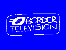
Richard Henderson also reckons Border has a nice logo and wondered if anyone knew what it was supposed to represent?

|
Stuart Burns explained: I seem to remember reading somewhere that it was supposed to be an abstract representation of the geographical area covered by the station. Anyone who gets Border will know that they basically cover Carlisle and the Isle of Man. They try to justify their coverage of the Scottish Borders by including the occasional news report from there. I'm not sure how this can be (perhaps he's thinking of the Ulster logo?) - this is the Border logo I remember: (with the logo standing for a sort-of "B")... |
And finally, Sean Hughes (not the comedian) wrote:
Ok, I've been reading these comments for a couple of days now, with much interest. I just happen to have on VHS a series of ITV (and a few BBC) station idents dating back to the '60s, including logos from: Thames TV (1970s, 21st anniv. & 1990s), the mind-blowing Harlech b/w logo, the scary 1970s Yorkshire logo, the old 'moving ribbon' LWT logo, ATV, Southern, Anglia (the airfix knight), Westward, LWT (orange, c1969/70), Rediffusion, ABC, Channel TV, TSW, Scottish, Ulster TV, TWW (Teledu Cymru) and several others.
I also have a video capture card!
And the rest is history! Sean sent me his video grabs and you can see them by following the links below. Sean also has his own site with the full selection, some of which he mentioned above.
Other pages in the TV Logos section... |
|
|
|
|
|