The Thames Logo Parade
Created Sa 10-Oct-97
Revised Tu 1-Sep-20
|
|
The Thames Logo Parade Created Sa 10-Oct-97 |
|
 
Screenshots above provided by |
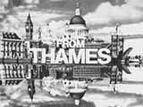
THAMES' first logo, in black and white, had a different skyline from the one familiar to us in the colour logo. It appeared in an oval frame with a white border (top left). According to Kaleidoscope, the original test footage of this was found in late November of 1995 in a dusty cardboard box in an attic at the Teddington Studios. Jeremy Rogers writes, "Various tunes were used, including the old ABC ching-chang-chong." At first, only viewers in London were treated to this picture post card, the rest of the country had to make do with an animation featuring the caption on the bottom left. |
|
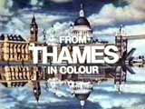
The first colour logo appeared in November 1969. Notice how the reflected dome of St. Paul's Cathedral is mutated to give a realistic (or even scary!) reflection. The logo below it is the more modern Thames skyline logo. The clouds and the sky seem far better defined. Jeremy Rogers has an explanation for this: "Thames redid their sequence in about 1984-5 so as to keep it in a digital form, rather than on film." 
 |
 Above is a composite image I've produced from the QuickTime Movie of the ident by John C. Bain. If you place a mirror where the tiny arrow is, you can make your own Thames logo! Notice how the clouds appear the same as the original logo, but now the reflection looks more like a plain mirror. The landmarks used in the logo are all well known, except perhaps for one. What is the building on the far left? At first sight is appears to be County Hall, former home of the GLC and now a hotel, fish tank (The London Aquarium) and ticket hall/cafeteria for the London Eye. But Duncan Lynskey has been in touch to say that he recognises the building as the former home of the City of London School, which he used to attend. Duncan was puzzled as to why the building appears without its small spire on top. |
 |
The end caption for Thames said simply FROM THAMES and later FROM THAMES IN COLOUR. Jeremy Rogers writes, "Thames used the phrase... at the end of its own programmes until about 1973 when they introduced the copyright statement." Then they went for the more usual THAMES COLOUR PRODUCTION, although the other captions remained for programmes which they didn't make themselves (for which other ITV companies would have used Colour Presentation). |
 |

|
The animated ident was created just as you would imagine. The top half of the image was laid flat and filmed from above. A sheet of foil was used to provide the reflection and was at a slight angle from the perpendicular (hence the tall vertical structures bend in towards St. Paul's dome in the reflection for a more realistic effect). Using stop-frame animation, à la Wallace & Gromit, produces the appearance of movement. The skyline image didn't have the letters on it. The letters were filmed separately using the same process and then the negatives from both films were married together to produce the final effect. Treating the letters separately allowed for the reflected letters to be faded out. |
|
Who Did It? The Thames skyline ident was created by design company Minale Tattersfield. They created the classic gold on green identity for Harrods in 1967 and went on to produce TV branding for the launch of Central Television in 1982. The jingle was composed by Johnny Hawksworth and is based on the old London flower-selling girls' tuneful cry: "Who will buy my sweet lavender?" Hawsworth created many theme tunes for television programmes, including Thames sitcom Man About The House. |
|
|
|
The Sound of Thames (107 918
bytes)
From the early 70s, here is the familiar Thames jingle followed by in-vision continuity announcer, David Hamilton, saying, "Good evening. We've got an action packed evening for you tonight on Thames." |
| (This isn't actually a genuine Thames continuity announcement, but rather part of a spoof used at the beginning of an episode of Monty Python's Flying Circus. In the programme Diddy David goes on to say, "But first here's a rotten, old BBC programme.") | |
|
Here are a couple of special versions of the skyline logo. The first is a night-time version, dated 1980. 
|

The second is a Merry Christmas from the Teddington in Middlesex. After Thames lost its franchise, the studios became an independent production centre. But the buildings were demolished in 2016 to make way for flats. |
|
The Morecambe & Wise Show also featured a special opening ident which featured
a sung jingle. "Here they are now, Morecambe & Wise."
But perhaps the best known use of the ident was by Kenny Everett who used to burst through the logo at the end of The Kenny Everett Video Show. (The film was shown backwards, so it appeared that the paper was being repaired rather than torn!). |
 Screenshot provided by Darren Meldrum Cuddly Ken was also responsible for a saucy animated version of the Thames logo! |
As well as the logo used on screen, Thames had another version of the logo that was sometimes used in print. I always thought this was an attempt to re-create the Thames skyline out of silhouettes of ships. (I thought I saw sails with flags on top.) But it's now plain that this is simply a re-processed version of the original black and white post card skyline. |

|

|
By the end of the 70s, Thames was using a print logo based on the familiar colour logo. The reflection was missing, and horizontal stripes were added. It resembled the mock-up seen on the left, and sometimes it incorporated the legend "LONDON'S WEEKDAY ITV" below it. |
|
Thames also used a logo without the reflection at the end of programmes it made for Channel 4, which came along in 1982. 
|
|
|
Animated
Thames Logos Relax and watch the ripples on the Thames on a very calm day and an equally calm night! These animations are based on a Java applet written by David Griffiths. |
|
Screenshots above provided by |
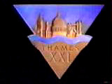
In 1989, Thames was 21 years old and it commissioned a new logo to celebrate its birthday. The stone flew through the air with rays of light shining through the THAMES XXI letters. Why did Thames choose a triangle shape? Possibly it had something to do with "getting ready for ITV". ITV was shortly to launch its new corporate identity which involved each ITV company having a special animated ident with a version of their logo in the triangle. The new Thames logo fitted easily into this scheme without mangling the logo. |
|
Thames had one last (animated) ident, seen only in the London area before programmes. (ITV had long since dropped station idents from the beginning of programmes.)  |
 Having lost its franchise, Thames ceased broadcasting at the end of 1992, leaving Carlton to take over. But Thames didn't stop making programmes (such as The Bill) and above you can see their first independent caption (they simply removed the "for ITV" bit). |
 |
This last Thames ident features a showcase of its programmes. It was used in the final broadcast on New Year's Eve in 1992.
|
In 1993, Thames was bought by Pearson plc. In 1995, Pearson Television was formed following the acquisition of another famous brand, Grundy, whose name is seen at the end of Neighbours. When Channel 5 launched in 1997, Pearson created a new Thames logo, removing nearly all of the famous skyline in the process. There were fears that the Thames name and that of Grundy, would be phased out. But these proved to be unfounded. |

Screenshot provide by Rob Sedgebeer |
 |
In 1998, the Thames Television brand was 30 years old. I made the image above to celebrate the occasion! |
 |
In July 2000, Pearson Television merged with CLT-UFA to form the RTL Group. Because the new company was no longer a wholly owned subsidiary of Pearson plc, it was decided a change of name was required to reflect this. Hence the following year Thames owners became known as FremantleMedia. With the new brand of its parent company came a new Thames logo. The bridge landmark had gone, but the reflection of the lettering harks back to the very first skyline idents. |
|
In February 2003, Fremantle brought together Thames Television and Talkback Productions to create talkbackTHAMES, the largest independent production company in the UK. At first, the Thames name was allowed to appear by itself, but it wasn't long before a new talkbackTHAMES logo was created and an animated version started to appear at the end of programmes. |

Thames / 19 production caption from the end of a 2003 edition of Pop Idol |
|

|

|
|

Captured from All-Star Family Fortunes |
||

|
In January 2012, as part of a restructure, FremantleMedia made Thames and Talkback separate subsidiaries again. As a result, Thames got a new, animated, purple logo. |

|
|
In July 2018, Thames celebrated its 50th birthday. This may be why the new logo it introduced was a gold colour. On screen, the text also animates the same way as it did on the original Thames ident: as it emerges, it is reflected in a mirror and the reflected text then fades away. A nice touch! The video on the right was captured from the end credits of The X Factor. |
|

|
|
|
|
|
|