
The BBC Logo Gallery
Created Sa 20-Dec-97
Updated Mo 1-Apr-24
In the beginning...
In the BBC became the world's first broadcaster of a regular "high-definition" television service. In the beginning, the gaps between the programmes would be filled with tuning signals (also known as test cards) or on-screen announcers.
The first attempt at proper branding was first seen on the evening of when the "bat's wings" logo appeared.
Abram Games, famous at the time for designing the logo for The Festival of Britain of 1951, was commissioned to design the Television Symbol, which was actually a brass model whose centre circles could rotate. For BBC Scotland the spot in the middle was replaced by a lion. There were also other regional variations (static captions) as well as a matching clock.
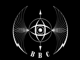
Screenshot provided by Jeremy Rogers
This new logo replaced the BBC coat of arms on screen, and would be seen before programmes such as Quatermass II.
The way the BBC presented itself would soon become more important as in it would begin competing for viewers with ITV, Britain's first commercial television service.
The Sixties

saw the first example of the BBC lettering in boxes. Initially the letters were slanted with the boxes upright. Later, this would evolve into the familiar BBC corporate logo, with slanted boxes.
This map ident was seen before programmes such as That Was The Week That Was.


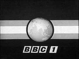
Perhaps a map of the British Isles was not thought grand enough to represent the BBC, because in the ident gave way to a map of the world! Originally the background was a single colour - the two-colour background with the diagonal line was added later. The BBC logo that was superimposed onto the spinning globe would fade in before the next programme started, to coincide with the announcer saying, "This is BBC Television." Notice the boxes now slope with the letters, as they would for many years to come!
This ident was seen before programmes such as Doctor Who.
The globe and the map idents came with clocks that had very long second hands.
1964 – BBC 2 begins
Both the BBC and ITV were broadcasting in the VHF band using 405 lines for the pictures. When the BBC began its second channel, in , it was broadcast using a new standard. This time the pictures were transmitted in the UHF band and were higher definition, containing 625 lines. This meant that to watch BBC 2, viewers needed a new dual-standard TV set.
The mascot of the station, as far as I recall, was a zebra, hence the stripy effects in the logo. But the station launch was advertised by a pair of animated kangaroos. "Hullabaloo" represented BBC 1, as it would now be known, and in her pouch was her new baby, "Custard", representing BBC 2. Hullabaloo was so-called because BBC 1 was about song and dance. After hours of fruitless brainstorming, so the story goes, a BBC bigwig decided the baby kangaroo should be called Custard since custard goes with everything!


The appearance of the second BBC globe, coincided with the launch of BBC 2. But the globe wouldn't yet show BBC 1 (even though that is what the announcers called it). This may have been because BBC 2 wasn't available outside of London to start with (and you needed a new TV set) and so the BBC didn't want to annoy viewers who couldn't see the second channel. Or perhaps the designers thought both idents should share a consistent "BBC" logo.
There were two further black and white globes in the Sixties.


Screenshot by Sean Hughes
1967 – First broadcasts in colour

Screenshot by Sean Hughes
BBC 2's coverage of Wimbledon on marked the official start of the first regular colour television service in Europe. The channel began broadcasting about five hours of colour each week in this 'launching period' until a full service started on .
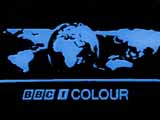
Colour broadcasts officially began on BBC 1 and ITV on , when they followed BBC 2 by launching a service in 625 lines on UHF. (Colour was never available on the old 405-line VHF system, which continued running until the 1980s.) To watch in colour viewers would require a new television set. To encourage viewers to get one, TV stations heavily promoted their use of colour and added a reference to it on their idents.
Take the two idents above, change the colours and the typeface and you end up with the set below from .
The BBC 1 COLOUR globe was frequently seen in Monty Python's Flying Circus, which featured spoof continuity announcements.


The Seventies
By the mid-70s, the slanted BBC corporate logo was all but forgotten, save for an appearance on the BBC 2 clock.
BBC 1 began to use three colours - a blue background, a yellow globe with the channel name in white Future Bold letters. This new symbol appeared after .


BBC 2 kept the same colour scheme but got a new symbol made up of horizontal stripes. The revolving cube was replaced by a cylinder device, which made the white stripes rotate one way and the light blue stripes rotate the other, before meeting back up again to form the number 2.
View the "2" in action as the stripes revolve around the cylinder.
|
|
Play Now. (Requires RealPlayer 8 or later or a VLC player plug-in) (4s) |
|
|
Playback jerky or not working? Download first in Real Media 8 format and then play with VLC media player or Real Player 8 or later. (20 130 bytes) |
| MPEG | No RealPlayer or want higher resolution? Download in MPEG format. (608 438 bytes) |
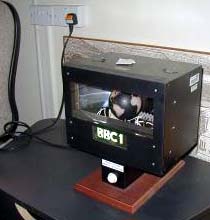
How they did it
Before the introduction of computer-generated graphics, the BBC clocks and idents were mechanical models filmed by a black and white camera. The colour was then added electronically, substituting for black, white and grey, making it extremely easy to change the colours for each new look.
The contraption shown on the right, comprising a camera, a light and a curved wall of shelves housing each of the models, allowed the operator in presentation to switch between different captions. It was affectionately known as "Noddy" because the camera would move up and down on a pivot in order to point to the right ident.
You can see apology captions scattered around the picture and the BBC Schools and Colleges 60-second countdown clock just above the centre of the picture. The BBC 1 globe is to its left.

Screenshot by Gareth Randall
Christmas

During the Christmas period, the BBC traditionally shows special festive idents.
This one appeared before the world television premiere of Butch Cassidy and the Sundance Kid on . Notice the stripy BBC 1 lettering.
The Eighties

By the 1980s, the "futuristic" stripy lettering, which had been experimented with on programme slides and other captions, had been adopted on the idents for both channels.
The BBC 2 ident changed first, and was quite a departure from previous incarnations in that it didn't exist on film, nor was it a model housed in the Noddy room. Instead, the symbol, designed by Oliver Elmes, was played out from a solid-state device, created by BBC engineers. Not only could this produce a still image, but it could also show two moving sequences, animated by the BBC Computer Graphic Workshop. Each animation lasted four seconds. The first began with a black screen onto which the stripes and the number were magically drawn from left to right by an invisible hand. The second showed the symbol disappearing, again from left to right, as if the pen was filled with black ink.
The BBC 2 logo was seen in spoof continuity announcements in Not the 9 O'Clock News and The Young Ones.


The BBC 1 globe and the clocks for both stations still existed as mechanical models. But after the success of the solid state 2, the clocks were also soon to become digital entities, leading to some subtle design changes.
The ring in the middle of the clock face was replaced by a solid dot, the hour markers were also changed and on BBC 2 the logo beneath the clock would finally have all the different shades seen in the main ident.


The BBC 1 globe was modified for a couple of special events in the 80s.
In , the BBC celebrated 60 years of broadcasting, with a week of commemorative programmes. This 60 BBC Years globe was used to introduce them.
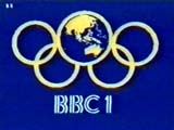
In , because of a technician's dispute on the commercial channels, the BBC had exclusive coverage of the Olympic Games. These days, the International Olympic Committee, like all brand owners, gets very upset if its 5-ring symbol is modified like this.

Goodbye mechanical globe...
One of the last mechanical globes spent its retirement years in the foyer of BBC Research & Development, based at Kingswood Warren in Surrey. Visitors could press the button and watch the world go by for a minute. Sadly the model was later removed as part of a refurbishment. The BBC left Kingswood Warren in .
...hello Computer Originated World (and hello to you, Two)

In the globe went virtual, as a new computer generated identity for BBC 1 was introduced. It first appeared at 7pm on , when Wogan began his new thrice-weekly chat show. Twenty-four hours later, the new globe would be introducing a brand new soap opera called EastEnders.
It wasn't until that BBC 2 got its new logo. This was designed by BBC Senior Designer, Alan Jeapes, who also, incidentally, designed the opening title sequence for EastEnders.
For the first time the digit "2" was dropped in favour of spelling out the number. The ident could be animated to show the letters emerging from the white background, or to show the letters disappearing into the background (which was often seen at closedown). When there were subtitles on Ceefax, the hard-of-hearing ear symbol was added between the first two letters.

See the letters disappear into the background as the announcer introduces the last ever Moonlighting.
|
|
Play Now. (Requires RealPlayer 8 or later or a VLC player plug-in) (5s) |
|
|
Playback jerky or not working? Download first in Real Media 8 format and then play with VLC media player or Real Player 8 or later. (19 924 bytes) |
The corporate logo gets a make-over
In , the BBC decided that if it was to compete effectively with its commercial rivals, it would need a strong corporate image to make its products stand out in the market place. A new corporate logo was commissioned to be used on its stationery, videos, books and even paper cups. The new image, designed by Michael Peters, looks back to the old, traditional BBC logo, but is updated by underlining the slanted boxes. An animated ident was produced with a jingle, which was used for BBC promotional films (e.g. to tell us how good value our licence fee is), BBC videos and exported programmes.

The three colours are those of the phosphors on a colour television (the primary colours of light, also used in the BBC "TWO" logo). There were also national variants. BBC Scotland had its underlines all in blue; BBC Northern Ireland used three green underlines; BBC Wales used all red. (In peculiarly British fashion there is no BBC England.)
The Nineties


")

In the 1990s, Martin Lambie-Nairn's design company took over responsibility for the BBC's idents. Lambie-Nairn had earlier successfully created the idents for the launch of Channel 4 and had also worked on branding the BBC's 9 O'Clock News.
A new look for both BBC 1 and BBC 2 was unveiled on . A new logo for the Open University was seen first, with the new BBC 1 ident being launched by Philip Schofield and Sarah Greene before that morning's Going Live!.
This ident was loosely based on the traditional globe and was designed by Daniel Barber. The full animation lasts 60 seconds before looping around, but viewers would only usually see a short clip taken from one of nine official starting points.
On BBC 2, there were 11 different idents, all featuring the escapades of a large "2" with a viridian (bluey-green) colour theme. More would be added later. It was this set of idents that, it is said, have proven the value of strong branding. Within six months of the new package going on air, the perception of BBC 2 had changed from that of a formal, stuffy channel and the audience had increased, even though the programmes themselves had largely remained the same.
Although each channel had a different style, Lambie-Nairn brought back a consistency to the idents - both featured the BBC corporate logo underneath a large numeral, clearly identifying the channels as well as the broadcaster.
The new idents were broadcast from modified LaserDisc players.


The corporate logo gets another make-over

After only six years, the BBC decided another re-launch was necessary. This time not only would Lambie-Nairn tackle the two BBC channels, but also the BBC's corporate logo. The old one, the Beeb said, was no longer up to the job. Apparently, it just didn't "work on screen". To make it work, the coloured lines underneath the three lozenges were banished, the sides were straightened from their 17.5-degree slant, and the typeface was changed to Gill Sans. Oddly, Lambie-Nairn reportedly claimed the 1988 logo hadn't been modern enough. Yet after its make-over, the new, simpler logo is very reminiscent of the BBC's first from 1932. And the new typeface, based on that used on the London Underground and other London Transport, was invented in the 1920s.
The cost of the new look was reported by some sources to be over £5m spread over three years, which covered everything from the designing of the idents to having new letter-heads printed.
When the change was first rumoured back in , Gerald Kaufman, the chairman
of the National Heritage Select Committee said, It seems to me there
could be a more useful way of spending licence-payers' money. This
confirms that while the BBC is funded by the tax-payer and theoretically
accountable, in fact it does exactly what it wants to.
British Ballooning Club?
The first on-screen sighting of the new corporate logo came with new idents for BBC 1 and 2 launched on Viewers were also to discover that the channels had also been renamed to "BBC One" and "BBC Two".
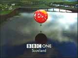

Screenshots above provided by Martin Deutsch
The popular "2" idents were simply adapted by replacing the old corporate logo with the new one and by conforming to the new naming scheme. New comedic adventures of the channel's star performer continued to be made.
But the biggest change was on the main channel. The globe had become a balloon seen flying over, initially, ten different locations in the UK, including Snowdon, the Forth Rail Bridge and Canary Wharf. The films apparently cost £500 000 to make.
In 1999 I spoke to Brian Eley at Lambie-Nairn for Channel 4's
Right to Reply and asked about the thinking behind the balloon.
He explained that the idea was that BBC 1 was bringing a world
of entertainment to every nation. And it's about
pride in a national institution. And after a few imaginative leaps,
it takes you to a hot air balloon taken to every part of the United
Kingdom.
The balloons were cleverly parodied in the opening titles of The Ben Elton Show.


Screenshots above provided by James Cridland
The balloon idents were filmed in widescreen and were first shown to the public in this format on when Sky Digital launched. BBC Two's existing idents were also re-jigged for widescreen use.
After their introduction, the idents were tweaked a little. First, the "888" caption was changed to read "Subtitles" (because digital subtitles aren't accessed via page 888 of teletext). Secondly, the BBC's website address was added above the station name. At the same time, new idents on similar themes were commissioned for both channels, including in 2000, for example, an Olympic Games balloon ident for BBC One.
A new news channel
On at 5.30pm, the BBC launched its first new channel in the UK since BBC Two. BBC News 24 was a rolling news service rivalling Sky News, which had begun eight years earlier. Sky described their new competition as a misuse of the licence fee, as it was only initially available to the two million viewers who had cable TV. Until digital television came along the following autumn, the rest of the country had to make do with watching BBC News 24 when it was broadcast overnight on BBC One.
The channel's identity used (mostly fictional) flags and a drum soundtrack, which was shared with the BBC's international news channel, BBC World.

The New Millennium
A new look for BBC Two was launched on . The antics of a large "2" continued, but now it was always coloured white and appeared in a yellow setting. The station name was now shown in a purple box in the bottom right of the screen on the idents and in trailers. No on-screen clock was produced, because the channel would no longer use one.


The End of the World
On , BBC One controller, Lorraine Heggessey also banished the clock and, after decades of use, the globe motif was gone too. New idents were launched based around the theme of 'Rhythm and Movemement' that showed various people dressed in red, dancing or performing. This time the name of the channel was in a red box in the bottom left-hand corner.
The box in the corner idea could also be seen in the idents and trails for BBC Three, a digital channel that replaced BBC Choice on .


The End of an Era

Three years later saw the end of the Lambie-Nairn era, as the dancers were replaced with images based around the idea of a circle. Red Bee Media created the idents, which debuted on , and included moon rovers, traffic going around a roundabout, dogs jumping through hoops, women mowing the lawn and swimming hippos.
On , BBC Two introduced new idents where the "2" was no longer a character, but was instead something you look through, a "window on the world", such as a 2-shaped sunroof in a car, a tent with a 2-shaped entrance and whatever this is...

The Teenies
- To celebrate 50 years of BBC Two new idents were shown and some original idents from the 1990s were repurposed. These stayed on after the birthday celebrations and continued to be used for four more years alongside occasional new idents following the original "character" idea.

- BBC One commissioned British photographer Martin Parr to bring his work to life on screen. A new set of idents around the theme of "Oneness" show groups of people coming together to take part in various activities including excercise classes, bog snorkelling, swimming in the sea and birdwatching.

- BBC One promotes its Christmas programmes with a two-minute animated film telling the story of a girl entering a talent contest at school. The film is set to the song Symphony by Clean Bandit featuring Zara Larsson.
- BBC Two was no longer represented on screen by a "2" for the first time in over 27 years. In 16 new animated idents, the screen was split along a curve that only hinted at the digit. The rebrand was created by the in-house team, BBC Creative, in partnership with new brand agency, Superunion.

The Twenties

In the BBC began to roll out its first corporate typeface, named after the organisation's founder, John Reith. BBC Reith was designed by type studio Dalton Maag and was quickly adopted on screen and online by BBC Sport.
In the font would appear in a new BBC logo when BBC Select, a new streaming service, was launched in North America.
The new corporate logo finally appeared on British screens on , when it was added to the idents, menus and trailers of the four main channels. The update came after audiences told the corporation that the existing logo made its services look old-fashioned and out of date.


BBC One returned to the circles theme when it began using a new set of idents at 7pm on . The idea is to show a scene, and in the centre a lens appears, revealing what that scene looks like at different times of the day. In the first ident shown just before The One Show we can see skateboarders, but can also see a rave and a life drawing class happening in the same space...

The new corporate logo has been introduced gradually, with BBC News waiting until to use it on screen. BBC Sport adopted the new blocks with the launch of its Wimbledon coverage in . BBC Weather bulletins weren't updated until , with new idents for CBBC and CBeebies finally arriving in .
100 Years of Our BBC
In early the BBC started using short animated stings to celebrate its broadcasting centenary.
Then on , exactly 100 years since the British Broadcasting Company (as it was back then) was formed, it began broadcasting a small number of special idents to replace those normally seen before programmes on BBC One, Two and Four.


Other pages in the TV Logos section...
- Section Contents
- THAMES Logo Parade
- BBC Logo Gallery
- BBC 1 1985
- Station Idents from the Seventies
- Station Idents from the Eighties
- ITV 1999
- ITV 2002
- ITV 2003
- ITV 2004
- BBC Flash-free Files
- More Flash-free Files
- Flash Files
- More Flash Files
- LWT Flash Files
- Screensaver Flash Files
- Cult Programme Logos
- Worst Logo Competition
Other Related Web Sites
- In December 2013, BBC News online celebrated 60 years of the BBC's first television symbol with an article that included a video of clips of BBC One idents to date. It also published a second video, that also appeared on BBC Breakfast, telling the story of Abram Games' bat's wings ident with reporter Nick Higham showing us some of the old mechanical models from the 70s and 80s.
- You can read more about the creation of Abram Games' Television Symbol at the BBC's official website. It also has a selection of films of old idents in its Cult / Classic TV / Test Cards section.
- TV Home automatically records idents from the four main BBC channels (and ITV) and has a history going back to 2018.
- Lambie-Nairn was one of five consultancies that joined forces to form a new brand agency, Superunion. This has since become Design Bridge and Partners. Their website features a case study on designing a new identity for BBC Two.
- The 'lens' idents for BBC One were a collaboration between BBC Creative and agency ManvsMachine, whose website goes behind the scenes to show how the idents were made.
- Andrew J Wood has a selection of the 100 Years of Our BBC idents on his website, The Ident Gallery.
In November 1999, I got to make a film for Channel 4's Right to Reply about television channels and their brand images. I spoke to Brian Eley, Creative Director at Lambie-Nairn, who explained the thinking behind the new BBC One balloon idents. Click on the link above for a transcript of the item with screenshots as well as video to download for those with RealVideo and MPEG players.


