Dave Jeffery's
Flash-free Files 2
Created Tu 1-Sep-20
Updated Mo 2-Mar-26
Contents
- Idents and Break Bumpers - graphics, sometimes animated, identifying the channel you were watching or the company who made a programme. Now with the HTV, HTV West and HTV Wales idents introduced in 1982.
- Clocks - as used by the ITV companies and Channel 4. Now with the analogue clock used by Yorkshire Television in 1983.
- Schools & Colleges - the ITV Schools countdown clocks plus the Westward Schools caption and the ITV Schools slide from the mid-Seventies.
- Test Cards - the colour bars from HTV and the IBA's ETP1, an electronic test pattern introduced in the late Seventies.
Idents and Break Bumpers
ABC began broadcasting in 1956, providing programmes at the weekend in the Midlands and the North. As with other ITV companies, it used short animations in the commercial breaks called opticals or optics (depending on which company you asked). There was one optic at the start of the break and another shown between each advert, which is the one reproduced here. It uses ABC's triangle logo, introduced in 1958.
ABC's idents were updated in 1964, which a saw new, bolder typeface for the ABC lettering. The optics were updated too.
Associated-Rediffusion NEW! We 2-Jul-25
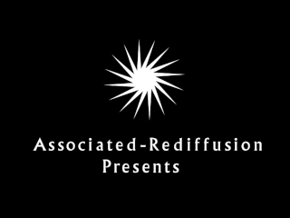
From 1956, this is Associated-Rediffusion's second ident. The previous version was the first ever ident seen on commercial television in the UK, back in September 1955, and featured a different jingle. The jingle heard here is simply the letters "AR" tapped out in Morse code, accompanied by two trombones. The jingle was also played out over a static caption.
Rediffusion - Black
Rediffusion
In 1964 after being re-awarded its franchise for providing the ITV service for London during the week, Associated-Rediffusion became Rediffusion Television Limited. On screen it was known as "Rediffusion, London". The black version of its ident was used for all its programmes for the first year before being relegated to regional use only. The fanfare was composed by Johnny Dankworth.
ATV - Presents Updated
In February 1956, commercial television came to the Midlands, with ATV providing the service on weekdays. The company introduced a new ident to show it now served two areas of the country.
There were also variations on ATV's 1956 ident. This one showed only the London details. It appears that only the main ident, above, was animated.
ATV Midlands - Presents
ATV From The Midlands - Presents
Here are two more variations of ATV's 1956 ident. The first is The Midlands version of the London ident above. The second tells viewers that the following programme is "From The Midlands".
ATV Midlands - Production NEW! We 2-Jul-25
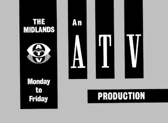
This is the production caption used at the end of ATV's programmes shown during the week. There is also a variant of this with "From the Alpha Television Studios, Birmingham" at the bottom.
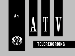
In the early days of television, everything you watched was either live or played out from film. Videotape recording was still being developed and so in order to preserve programmes, TV companies would set up a film camera in front of a studio monitor to make a telerecording. These could be sold to overseas broadcasters and also enabled programmes to be repeated. ATV would proudly announce its repeats with this caption.
Introduced in 1969 and used until the end of 1981, this ident heralded the start of colour programmes from ATV (now broadcasting to the Midlands all week) with a dramatic jingle by Jack Parnell, arranged by Wally Stott. The piece is performed by four trumpets, four trombones, timpani (E and B), a vibraphone and a barely detectable suspended cymbal. (There was an earlier, thinner version of the jingle that wasn't very dramatic at all and survives on some editions of Crossroads. It was quickly replaced.)
At some stage after it began broadcasting in colour, ATV went through a phase of using this brief animation between each commercial in the ad breaks. (The company had also used opticals in its black and white days.)
ATV - Colour Production NEW! We 2-Jul-25
With the start of colour broadcasting, ATV used a yellow on blue production caption at the end of its programmes. For Crossroads a caption with a black background was used, to match the credit sequence. In the early Seventies, the caption was redesigned so that the ATV symbol appeared in a box and a new typeface was introduced. In March 1973, the first word, "An", was removed.
Central - Production NEW! We 2-Jul-25
On New Year's Day 1982, ATV transformed into Central Independent Television. The brand identity for Central was created by Minale Tattersfield, the agency responsible for Thames Television's mirrored skyline. The agency brought together a globe symbol and a distinctive typeface, which you can see here on one of Central's early production captions.
From 1961, the "chopsticks in a bowl" symbol that appears to me to be a stylised "B". It is said to loosely represent the Border TV region, with the horizontal line showing the boundary between Scotland to the North and England below, with the fork on the left perhaps depicting the Solway Firth estuary.
Exactly ten years, to the day, after Border began broadcasting, its first UHF transmitter came into service, bringing with it programmes in colour and a new Border ident. Eventually, the word "COLOUR" was dropped. Sadly, none of these early idents were animated, nor did they come with any jingles.
Channel Updated
Channel Television, brought ITV programmes to the Channel Islands in 1962. The station's logo was the result of a competition. Six hexagons represent the larger inhabited islands, with the face of an 'heraldic leopard' in the top one.
Grampian began broadcasting on the last day of September, 1961. Its first ident showed the mountains of the North of Scotland turning into the Scottish flag, accompanied by a counterpointed version of Scotland the Brave with Crimond (the tune to the most common version of The Lord's My Shepherd).
This ident is from 1964 when the logo used a more traditional serif typeface, with the saltire zooming into view. The letters appear in time with the notes of the jingle, which is a different arrangement of the tune used in the original ident above. There is another version of this animation where the letters fly in to place.
Granada - Black & White -
Animated
Granada - Black & White
Granada began broadcasting in the North of England in 1956. Its first ident seen before its programmes on the ITV network featured an arrow reaching up to perturb the "N" in the station name. Station boss Sydney Bernstein was reportedly unhappy with the whimsical way in which his company was being presented and after a few weeks the animation was dropped, leaving a simpler ident that just faded in and out.
Eventually, Granada's ident was animated again. And if the arrow pointing to the "N" was too subtle before, the message "from the North" now appeared too. There was still no jingle.
In 1968, Granada introduced a new ident featuring only the company name between horizontal lines. It was animated, but only for regional programmes, and the trademark arrow pointing North was gone.
Granada - Colour I
Granada - Colour II
In June 1969, the arrow was back, now incorporated into a new symbol. It looks like a man on a unicycle carrying an umbrella, but served the company for over thirty-five years. Here you can see how it looked on Granada's first two colour idents. Sadly there was no clever animation nor memorable jingle to go with either. It seems idents were grim up North!
When colour arrived in Wales and The West in 1970, the ITV company serving the region re-branded as HTV. Their new symbol resembled a TV aerial. As well as the generic and HTV West versions seen here, there was also a version for Welsh continuity and programmes, which had "CYMRU" and "WALES" in the spaces at the bottom of the logo. The jingle features a Hammond organ, some brass and possibly a clarinet and flute.
HTV - Royal blue
NEW!
HTV West - Royal blue
NEW!
In 1982 HTV rejigged its idents with a change of background colour from navy to royal blue. On January 1st 1993, the aerial device was replaced with a new HTV logo, which lasted until 2004 when the newly-merged ITV plc banished all traces of the HTV name.
HTV Wales NEW!
Also in 1982, Wales got a new channel, S4C. Programmes in Welsh moved to S4C and consequently HTV Cymru/Wales became simply HTV Wales.
London Weekend
London Weekend - Widescreen
London Weekend's second colour ident was known internally as The River. It was designed in-house by Terry Griffiths. The accompanying jingle was composed by Harry Rabinowitz. The widescreen version was produced by Dave Jeffery and was broadcast only once, on the company's last day on air in October 2002.
London Weekend's black and white optic, a very short animated film shown before each commercial. It was still being used in the Eighties.
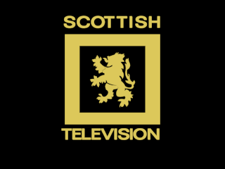
Scottish Television's third ident featured a somersaulting lion, zooming into view. The man responsible, Englishman Francis Essex, had joined Scottish in 1964 to make the company more 'showbiz'! It was replaced after only a few weeks with the version shown here, where the lion zooms gracefully into view, following a complaint from The Lord Lyon King of Arms, the man responsible for protecting Scotland's heraldry. The jingle was arranged by Ray Terry and played by the station's head of music, Geraldo, who later occupied the same position at TWW.
Scottish - Zoom - Yellow
Scottish - Zoom - Blue
Scottish began broadcasting in colour in December 1969, but had begun to make some programmes in colour on film before then. Its first colour ident was a yellow version of the black and white one. Later, the typeface was updated and the colours changed to white on blue.
To herald the start of colour broadcasting, Scottish ditched the lion for a logo made up of the STV letters in lower case joined together. The ident begins in black and white and turns into colour at the end of the animation.
From 1974, this is the silent 'tartan' ident of STV. The spacing around the 's' in the logo has been modified, perhaps to fit better with the transition from the tartan pattern. Compare this with the logo on the static caption.
Southern's first ident, used from 30th August 1958, has a star (or is it a South-pointing compass?) as its symbol. I don't know whether it's this nautical theme, or the basic animation, but this ident reminds me of Captain Pugwash!
Southern - Serves The South - Black & White
This Southern ident was seen both before programmes and at the climax to its start-up sequence for viewers in the region. Two variants were used - one, seen here, had "The Station That Serves The South" at the end, the other didn't. Both featured a crumhorn (or rather a couple oboes meant to have a similar sound) and percussion jingle by Steve Race.
Southern's colour ident conjures up memories of the ITV children's programmes that would follow it, such as Worzel Gummidge, Runaround, How and The Saturday Banana. The guitar jingle was composed by Steve Race. The Southern name and logo are now owned by Art Attack producer Nic Ayling.
The Station That Served The South slogan was also used on an extended ident when Southern started colour broadcasts. The jingle was also lengthened by repeating the last note.
For its break bumper, the middle of Southern's symbol rotated to form a solid circle. It reminds me of the cord-operated, clear plastic air vents that were once common in window panes!
From 1968, the ITV system would be reorganised, with the Midlands and North being served by one company each, seven days a week. The disappearance of its weekend franchises meant ABC had to look elsewhere if it was to continue to broadcast. Not wanting to put ABC out of business, the ITA offered it the chance to join forces with Rediffusion to run the weekday franchise in London. Both parties agreed, and together formed Thames Television. The plain "FROM THAMES" ident seen here was used before programmes made at what were once Rediffusion's studios. The jingle was composed by Johnny Hawksworth.
Thames Television's black and white break bumper, a very short animated film shown at the start of a commercial break. It was based on the ident above and was still being shown in the mid-Seventies.
When all of the ITV franchises were awarded for a new term to start in 1982, Southern was shocked to find it had lost out to a new company, TVS (Television South). Its logo was designed by John Hamon and the fanfare and station start-up theme were composed by Richard Hill. After eleven years on air, TVS would itself lose its franchise, to Meridian. But the logo was resurrected in June 2007 when it became a registered trademark of Television South Limited, an independent production house unrelated to the original TVS.
The fifth area of the UK to receive commercial television was South Wales and the West of England. Television Wales & West, known on screen as TWW, began broadcasting in January 1958. TWW's break bumper looks as if it was created by someone who drove one of those cars that have a single windscreen wiper.
Tyne Tees began broadcasting to the North-East of England in January 1959. With the arrival of colour television to the region in 1970, came a new logo and Tyne Tees' first colour ident.
These are Ulster Television's first and second colour idents in the form of static captions. An animated version was also seen from time to time. The zigzag pattern was in the logo from the first day of broadcasting and survived until 1993 when the company rebranded as UTV.
Westward Television brought the ITV service to the South-West of England in April 1961. Its symbol was a galleon. (You can see a version of this on the clock below.) Between each commercial, it chose to show a rotating hexagon.
This the ident used by Yorkshire Television's for its black and white programmes at the end of the Sixties. The short fanfare that accompanies it is based on On Ilkla Moor Baht 'At, a classic verse written in the Yorkshire dialect. (It translates to "On Ilkley Moor Without A Hat", which is often referred to as the county's "National Anthem"!)
Yorkshire - Colour I
Yorkshire - Colour II
This is the version of the ident used for colour programmes, claimed by some to be the scariest logo in the world! A later version in the Seventies featured only subtle changes, but still screamed the Yorkshire name before programmes such as Rising Damp and Emmerdale Farm.
Clocks
ABC Clock
ABC Clock - Midlands
ABC broadcast at the weekends, serving both the Midlands and the North of England. This clock was for joint continuity, parts of the programme schedule where both regions were showing the same programmes. It was broadcast from the ABC studios in Teddington, Middlesex and would be seen, for example, before World of Sport on Saturdays. The second ABC clock was seen only by viewers in the Midlands.
This ABC clock, without any logo, was seen only by viewers in the North.
ATV's digital clock was the last image broadcast by the company as it closed down for the final time, 34 minutes into the first day of 1982. Later that morning, the station was re-born with a new name...
When ATV became Central Independent Television at the beginning of 1982, Central kept its predecessor's clock for a while, superimposing the digits underneath its new logo.
This is Border Television's mechanical clock, used in the Eighties. It features the company's "chopsticks in a bowl" symbol.
Grampian Clock I
Grampian Clock II
In the Seventies, Grampian Television referred to themselves as GTV on their clock. By the early Eighties, they were using the saltire on its own.
Grampian Clock - Electronically Generated
Grampian's third colour clock appears to be electronically generated. It was used for most of the Eighties. The horizontal stripes were also seen when promoting programmes on trailers, captions and menus.
This is one of Granada's "clouds" clocks, which were used until 1968. Originally they had a serif font and a sweeping second hand, but by the mid-60s, they had changed to using a sans serif font and a second hand that stopped with a judder every second, as seen here. The clock face wasn't keyed onto the background, but instead was foil-printed onto the cardboard image of the clouds.
Moving into the colour era, this was one of Granada's clocks from the early Eighties. This was an analogue clock, but there was no visible bounce on the second hand.
When colour came to the Wales and West region in 1970, Harlech became HTV and its famous "aerial" logo was born. To go with the new white-on-blue symbol was this white-on-blue clock, which lasted well over a decade.
In August 1968, technicians at the ITV companies went on strike, leaving management to run an emergency national service. As a result, the ABC clock, with the ABC logo crudely covered with tape, was seen across the country for the first time. (See above for the original.)
Workers at the ITV companies went on strike again in August 1979. Programmes finally returned in October and ITV ran a national service whilst the regions got back up and running. The clock shown before the first programme after the strike, ITN's News at 5.45, was a rebadged Thames clock. (See below for the original.)
This was the London Weekend clock introduced at the same time as its famous River ident. It was unusual in that despite being a mechanical clock there was no judder perceptible on the second hand.
London Weekend Television Clock I
In 1978, London Weekend decided to become London Weekend Television again, or LWT for short. The clock was adapted, accordingly. To save space, it was mounted in a rack facing upwards and shot from above.
London Weekend Television Clock II
London Weekend Television Clock III
By the early Eighties, the logo and lettering were removed and the clock was redesigned to use the stripes from the ident. This clock was also shown with stripes either side of the dial. You can zoom into this second version to almost hide the stripes, as LWT would do before the end of 1982.
Rediffusion Clock - Black
Rediffusion Clock
In 1964, London's weekday ITV contractor began using an ident that ended with a rotating star, the Adastral, in the middle of a black background. The ident was later modified to use a grey background. These were the clocks created to match each version. The black clock made its first appearance in the evening of Monday, April 6th.
This was a clock used by Southern after the station began its colour service. The clock was still in use in 1981, the company's final year of broadcasting.
This Scottish Television clock resembled something you used to see on electric cookers. It was unpopular because if the camera wasn't aligned properly, it seemed to tell the wrong time, as the centre stalk to which the hands were attached actually came quite a way out in front of the clock face.
After the move to colour, STV created a clock with its new logo repeated to make a background pattern. There was an orange-on-black version and also a white-on-blue version.
In 1985, Scottish Television began to use a 3D logo representing Scotland's national flower, the thistle. It was designed by Peter Goodfellow. And this is how it looked on the new clock.
Scottish Clock - Blue
NEW! We 2-Jul-25
Scottish Clock - Purple
NEW! We 2-Jul-25
In 1989, Scottish flattened their 3D thistle symbol. A redesigned clock featured not only the revised thistle but also the new ITV corporate logo. The blue version came first. The purple version was introduced as part of a brand refresh in 1993.
Thames Television's clock displayed the date as well as the time. It was used until the end of the Eighties, when the Thames mirrored skyline ident was dropped and the ITV "corporate look" began.
TSW promoted itself as "Television Simply Wonderful" on its opening night in 1982. It ceased broadcasting ten years later, having lost its licence at the next franchise round. This computer-generated clock was TSW's only timepiece throughout its decade on air.
The second clock design used by TVS, which served the South and South-East from 1982 until the end of 1992. Sometimes the caption would say "TVS South" or "TVS South East", when different presentation was being transmitted in each of the two TVS sub-regions. Notice that unlike the BBC's mechanical clocks, which were filmed in black and white and then had colour added electronically, this TVS clock and the London Weekend timepiece above were coloured models shot by colour cameras.
This clock was introduced when Tyne Tees began broadcasting in colour in 1970. As well as white-on-blue, other colour schemes were experimented with such as light-blue-on-black.
By the late Eighties, Tyne Tees was using a more modern-looking clock with a yellow-on-blue colour scheme that matched its ident.
Ulster Clock NEW! We 2-Jul-25
As seen in the Seventies, a colour clock from Ulster Television, another company to use a yellow-on-blue colour scheme.
An Ulster clock from the Eighties. At Christmas they switched to a white-on-red colour scheme and added a pair of festive bells with some ribbon.
For some reason, Westward's clock, used until it ceased broadcasting in 1981, reminds me of one of those wooden-framed clocks you used to see on the wall inside banks. The exploded pie-chart style (with the bottom right-hand quarter of the rounded rectangle separated from the rest) was also seen on continuity slides for much of the Seventies.
Seen in 1977, this clock from Yorkshire Television features golden lettering.
Yorkshire Clock NEW!
Yorkshire's clock from the early Eighties. The hour markers look like plant pot tags!
Yorkshire Clock - Electronically Generated
Later in the Eighties, Yorkshire introduced its first electronically-generated clock.
Martin Lambie-Nairn and his company were responsible for Channel 4's identity when the station launched in 1982. This is the Channel 4 clock, which features the 4 logo made up of coloured shapes. For some reason they decided to use a dark blue rather than the main logo's light blue.
Schools & Colleges
ITV Schools NEW! We 2-Jul-25
The slide shown between schools programmes on ITV had resembled a test card since the black-and-white days. This was the final version of the design with grey bars and coloured spots, in the following school year images of landscapes and postage stamps were introduced.
ITV regions would sometimes opt out of the national schools broadcasts. When Westward did this, it would show a caption with its galleon symbol on it between programmes. It had grey bars on it, similar to the networked version. There were at least three further designs used by Westward until it lost its franchise at the end of 1981.
The ITV Schools 60-second countdown clock from the late 1970s.
ITV Schools - the final countdown
This was the last ITV Schools countdown clock, in use until the service moved to Channel 4 in September 1987. The caption shows the programme about to start is Middle English, but you can also try Living and Growing, Picture Box, Stop, Look, Listen and Seeing and Doing.
Test Cards
In the late 1970s, the IBA began broadcasting its new electronic test pattern, ETP1. This would eventually replace Test Card F (with the girl playing naughts and crosses) that the IBA had been sharing with the BBC. A version of of ETP1 was used in the test transmissions for Channel 4 in 1982.
Colour Bars on HTV I
Colour Bars on HTV II
These are colour bars used by HTV. The only difference between them is the white horizontal strip the second one has, running along the top of the block of red, in the lower half of the screen.
Other pages in the TV Logos section...
- Section Contents
- THAMES Logo Parade
- BBC Logo Gallery
- BBC 1 1985
- Station Idents from the Seventies
- Station Idents from the Eighties
- ITV 1999
- ITV 2002
- ITV 2003
- ITV 2004
- BBC Flash-free Files
- More Flash-free Files
- Flash Files
- More Flash Files
- LWT Flash Files
- Screensaver Flash Files
- Cult Programme Logos
- Worst Logo Competition
Other Related Web Sites
- Dave Jeffery has created a video of the clocks that Granada has used over the years and an amusing mock-up of a Granada closedown with the station theme on his YouTube channel.
- You can see the sheet music for the ATV In Colour jingle at Jason Robertson's sub-tv site. He also has three more Westward Schools slides on his page covering ITV Schools continuity in the late 70s.
- Transdiffusion's Rediffusion 64 website has lots of articles about Associated-Rediffusion's relaunch, which introduced new clocks and idents. Transdiffusion also have the press release from London Weekend from 1970 announcing their new stripy logo.
- ITV's official website is at itv.com.
- Channel 4's is at channel4.com.


